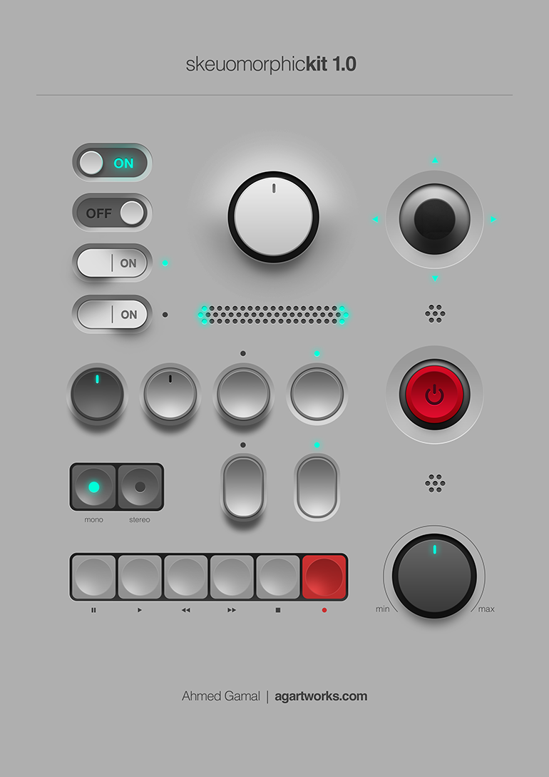

it’s weird that. it’s obviously possible to have a flat-shaded skeuomorph, just look at basically all of windows 95, but for some reason we connect them to this particular graphical style. files and folders are both part of the old classic “desktop metaphor”, so they basically have to be skeuomorphs. but like, the application icons are basically just mosaic tiles of the normal icons.
a proper skeuomorph would indicate what the program is for. krita and whatever map software that is are both good, if a little flat. but the libreoffice suite just being squares with a letter on them? have them be like, a spreadsheet for calc, a stack of cards for impress, and a printed page for write.
remember all the icons for windows 95 network utilities that have people in them? those are also (attempts at) skeumorphs because they’re trying to communicate what the program does.


explore the island you got stuck on. look around for details. sit down and watch the spectacle until you can continue. there’s no rush, and no such thing as wasted time.
or to be more prosaic, you go back home automatically after a short while anyway. not only that, every island gets thrown around by the storms periodically, launching them clear out of the atmosphere every five minutes or so. it’s just a matter of observing your surroundings, and something will happen.